Thatcher Studio Rebrand
Role: Lead Brand Designer, Photo Art Direction Agency: OMFGCO

Thatcher (formerly Juju Papers) is a Portland based design studio, offering a range
of hand-crafted wall coverings, tile, and home goods with a distinct creative perspective and a focus on sustainability. At a pivotal point in the brand’s growth, Thatcher approached us (OMFGCO) to reimagine their name and redesign their brand—balancing their hard-working roots with their vision for an elevated and highly curated line of products.
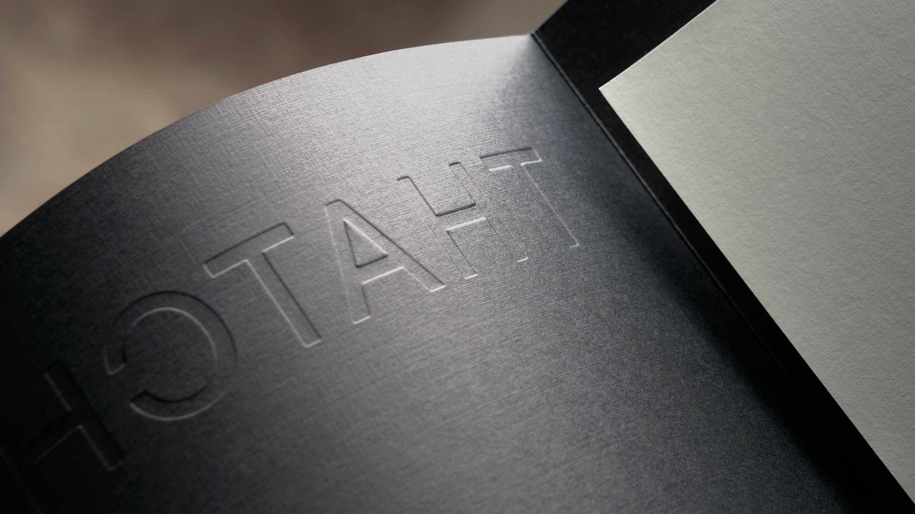
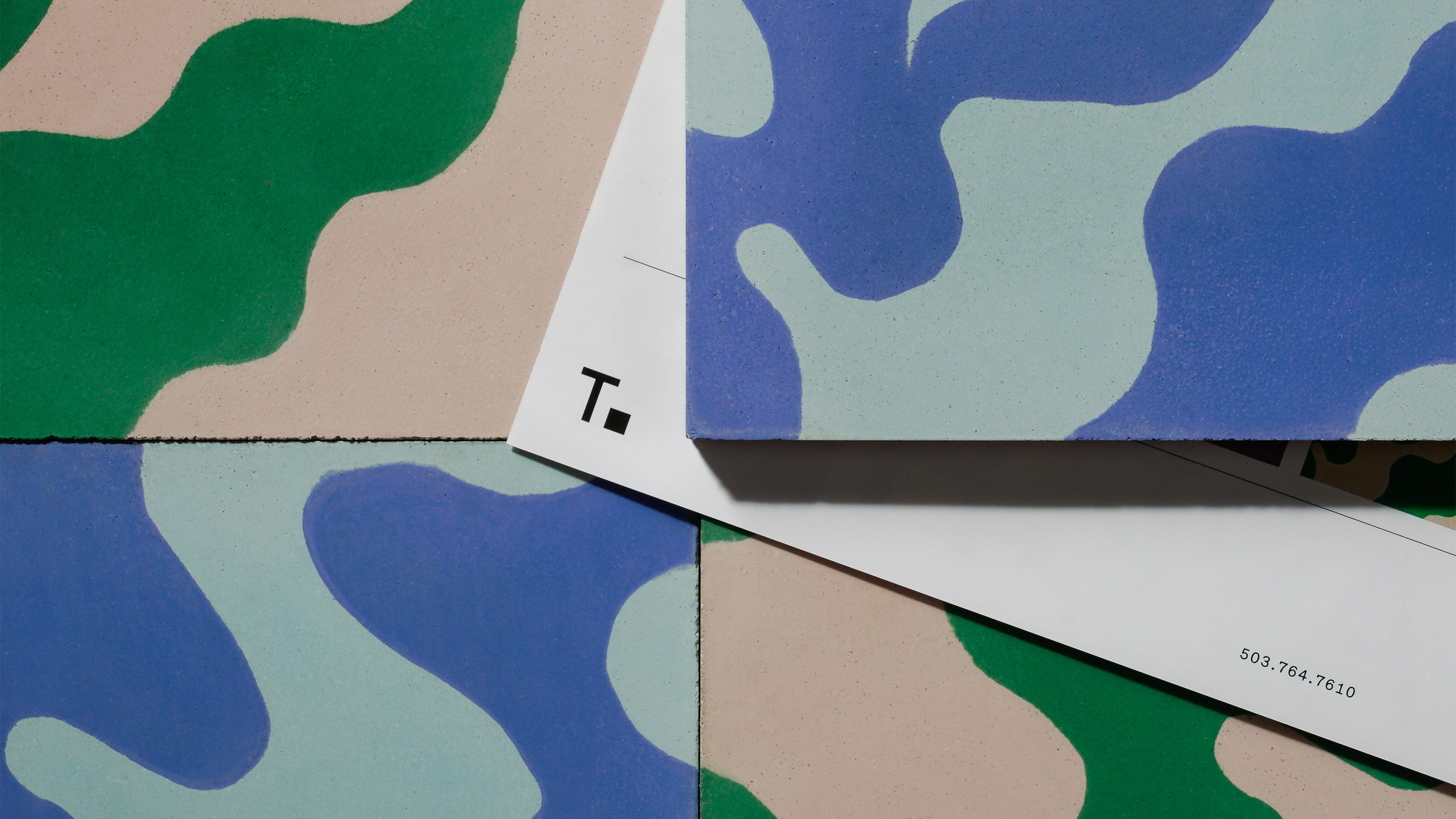
With the challenge of genuinely capturing both sides of the brand’s spirit—the down and dirty, sometimes chaotic nature of their process and the elegant and meticulous clarity of their vision— we took careful consideration to craft a visual system that works to support rather than to lead, ensuring that Thatcher’s beautiful products remain the focal-point of the brand.

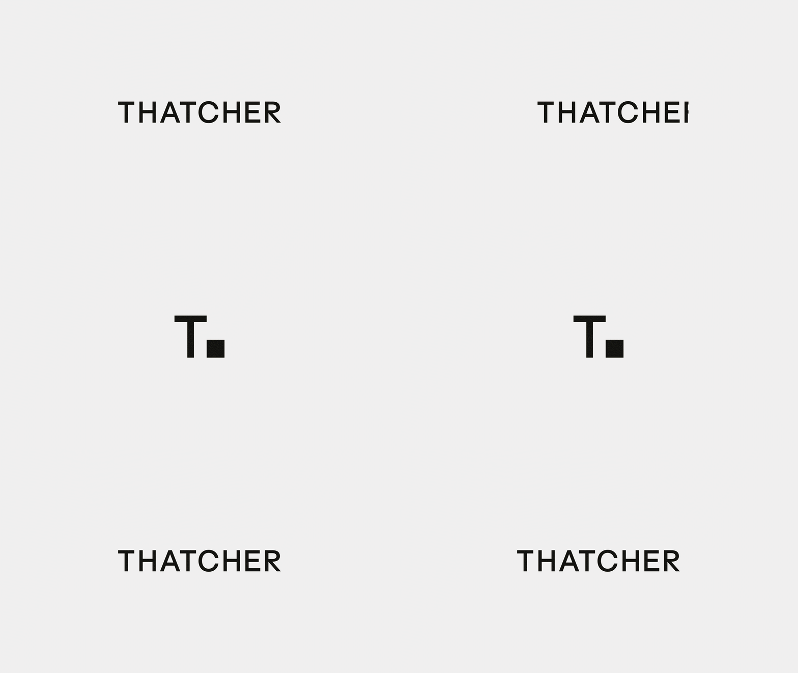
Drawing inspiration from the refined forms and architectural lines of Scandinavian design traditions, the Thatcher wordmark was created to reflect the open and complementary nature of the brand as it relates to its products, resulting in a confident yet minimal expression. The secondary mark expands on this idea of scalability, flexibility, and pattern design by pairing the letter ’T’ with a square—a foundational building block of structured form.
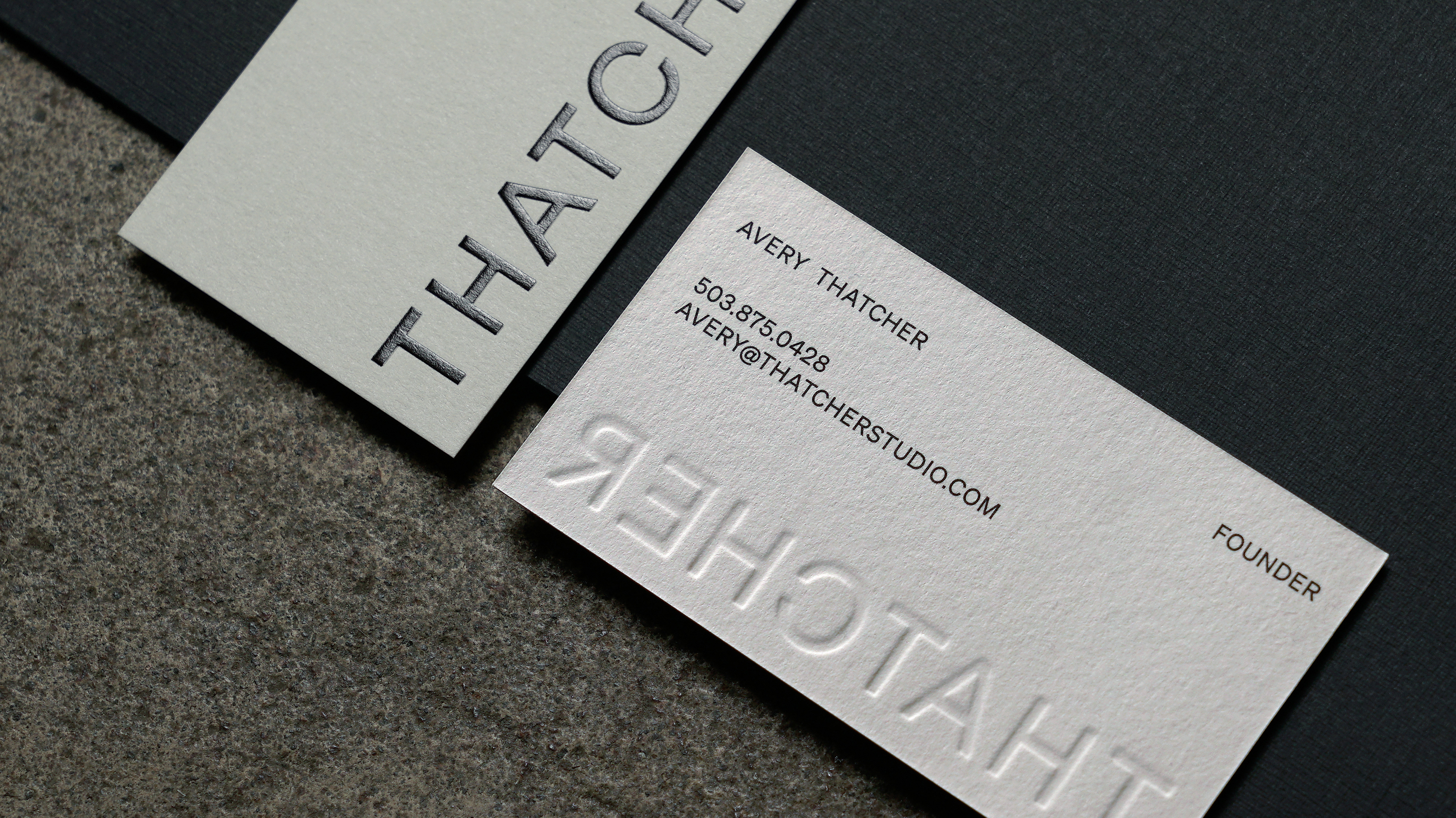
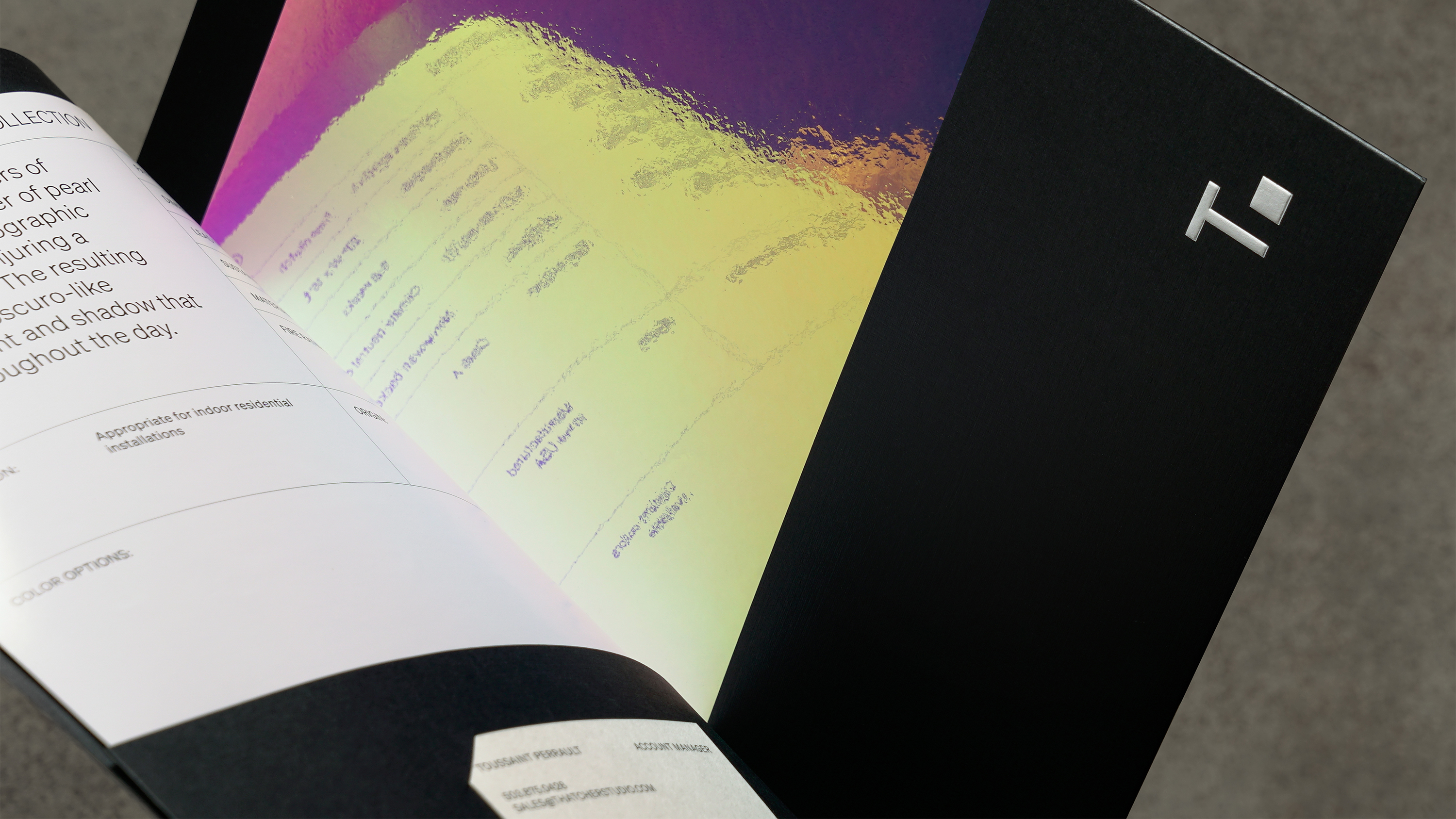
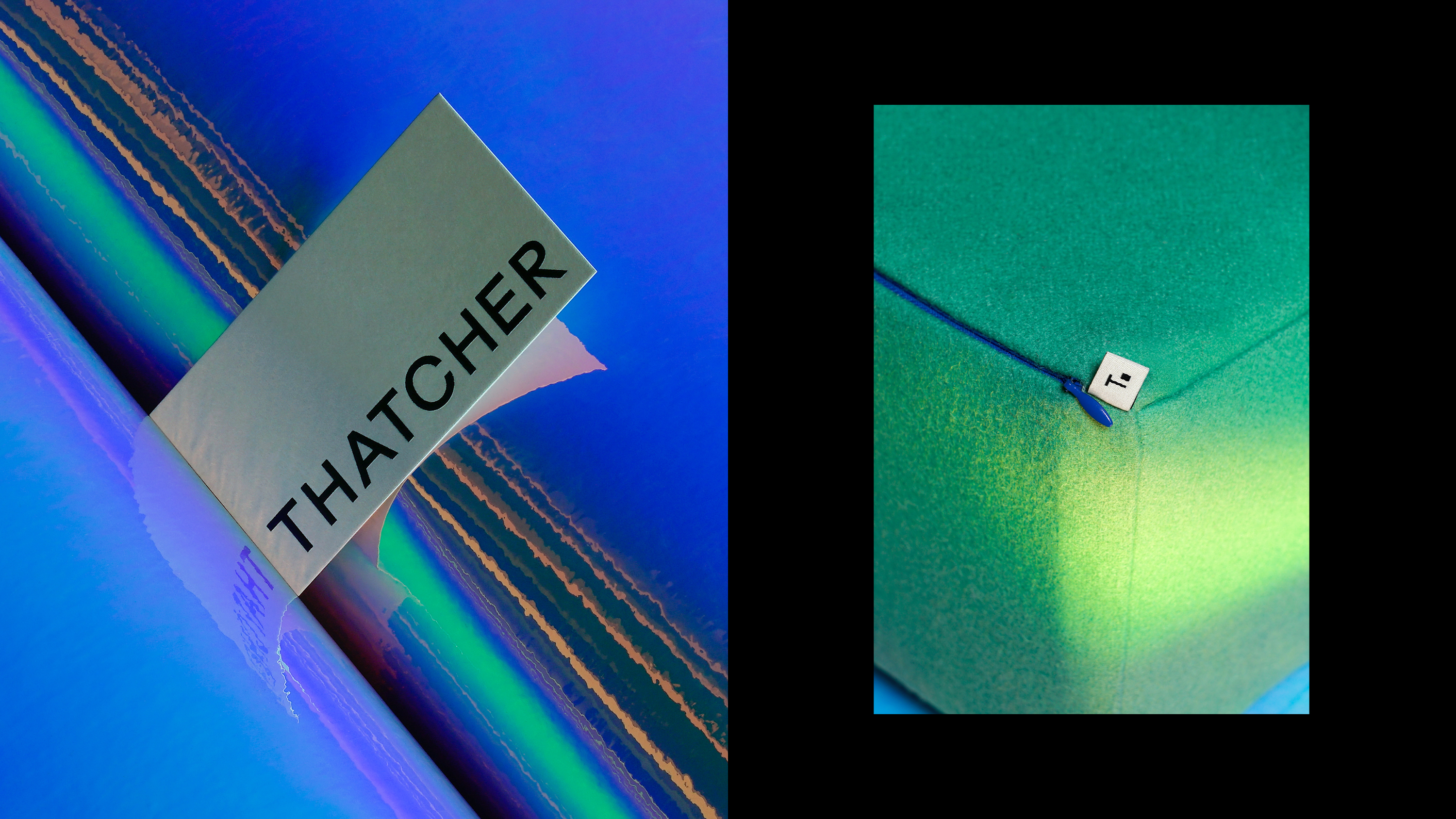
Employing the fundamental structure of a square as a starting-point, we created a visual system based around the connective framework of the grid, providing structure for images and typography while leaving space for organic dissonance when the grid is broken.


The result is a design system lives at the crossroads of fine art and imperfection, celebrating the unexpected beauty of opposites and expressing a bold richness of both elegance and chaos—the point between.
